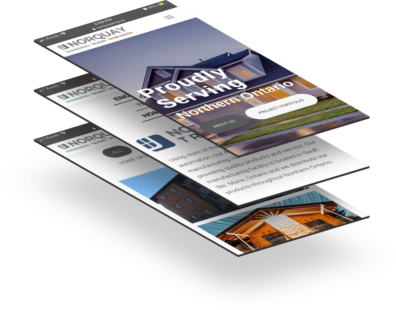
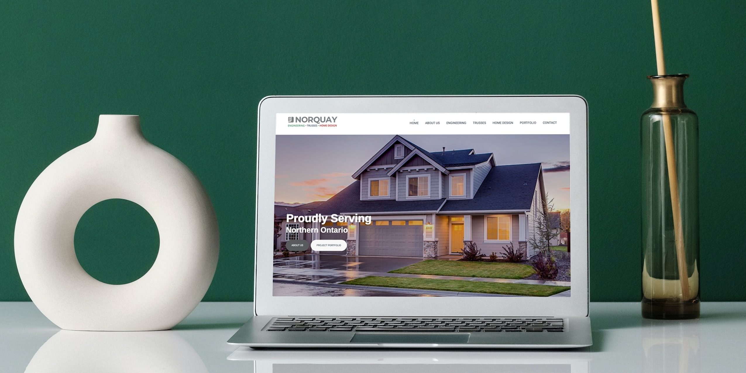
In early 2021, Sims Advertising designed, built and launched a new website for Norquay Engineering, Trusses and Home Design. Proudly serving Northern Ontario, Norquay is a multi-disciplinary design and manufacturing firm offering engineering, truss manufacturing and custom home design services.
Scott started Norquay Engineering in the early 2000’s primarily to support cottage, home and commercial builds in Northern Ontario. In the past few years, he noticed a growing need in the business, industry and community for other areas of discipline such as truss manufacturing and home designs.
Although Scott was able to support these clients at the time, this past year he decided to branch out his already well-established company to include and advertise each of his specific services. We were approached to solve this problem: “How does a small company highlight its different services and unique disciplines without losing, or distracting from, their strong core brand?”
The Solution
We started by looking at their current website and core branding for Norquay Engineering. Their simplistic logo has some fundamental design qualities that we wanted to carry through the sister brands. From this, we created logos for each facet of the business: Trusses & Home Designs, keeping the Norquay name not only consistent throughout, but front and centre. We designed each discipline’s logo to have a unique colour associated with it, giving the distinct differentiating feel, which we played off of when developing the website.
For the design and build of the site, we wanted to create a modern feel, but keep the warm touches that the company brings to its projects. Using white, greys and charcoals we were able to ground the site and emphasise each brand’s unique colour throughout the sections. This focus on the greys keeps “Norquay” at the forefront of the mind.
Each section of the site uses each brand’s colours to segment itself from the rest of the site, creating almost a micro-site feel. Each section includes content areas to dive further into that discipline’s unique expertise, without being too content-heavy.

Although the site is light on content, it is heavy on strategic content. Each of the brand’s specific projects are also included on not only their landing page, but also combined in the Portfolio section to expand on the company’s all-encompassing expertise.
User Friendly Design
We developed the website to be responsive, which is both user and mobile friendly. The intuitive design is easy to navigate and is accessible. Our goal was to create an open, modern, low-clutter website, allowing users to easily learn about the Norquay brand and its services, without too many pages or sections.
Our focus was also to build a site that would be easy for the client to update content, add portfolio items and perform other general tasks on the site internally.
Incorporating SEO
The fresh new website design is not only reflective of the Norquay brand, but also built with Search Engine Optimization (SEO) in mind in order to rank the pages higher in search results and bring more people to the site organically. Sims has therefore incorporated strategic content throughout the website and included a project portfolio gallery that keeps the website both relevant and aesthetically pleasing.
A website is often the first point of call when researching a product or service online. If you think it’s time for a website refresh, reach out to the Sims team today and we’ll help you reach your full potential.


